Thursday, February 26, 2009

Color Notes Too

Before we go into more about the color palette, we have to post about how absolutely beautiful the weather was here yesterday. David spent the entire day painting outside with Jack and Peter and it was great. It's fun to paint snow and not have to be bundled up like an Eskimo to do it. The snow is patchy at best around here at the moment, but in North Woodstock, because they tend to be in a bit of a snow belt, there are still some good spots. David drove by a favorite painting spot on the way home yesterday and was amazed to find that it was still fairly snowed-in looking. We'll be back there on Friday to paint for sure!...

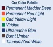
In this post we want to share how we mix up the palette to get the secondary colors. It's a bit of an experiment when you haven't tried it before. Consider this a refresher for those who have studied with us and an offer to explore for those who want to try it for the first time...

We mix an orange from permanent red light and cad yellow light. The idea is to get at a true orange, the color note that is exactly in between the red and the yellow. Anything else will be more of a yellow orange or a red orange...

We like yellow ochre as a color but find the tubed color to be somewhat gritty and not pliable enough. Why not learn to mix it yourself and understand what type of color note yellow ochre really is! By taking a good base of cad yellow light and mixing in some cad red light and a small amount of viridian, you will arrive at a rich and buttery yellow ochre color note...

Rembrandt cad yellow light is a remarkable yellow in that it does not lean towards green nor orange. We think it is a real true yellow. It can easily be moved towards a warmer note by adding a small modicum of orange or on the cooler side with the smallest amount of viridian. The key note here is very small amounts. Sometimes we will mix up piles of the warmer and cooler versions onto our palette...

Okay...so what IS lussier blue you ask? It's what you get by mixing equal parts ultramarine blue deep with viridian and a small amount of white to bring it to almost a cerrulean blue. We once heard from a painter who wondered why on earth do we put viridian green on our palette when you can get a version of it with cerrulean blue and yellow. Our answer is two-fold. One, we don't like cerrulean blue out of the tube. The lussier blue is very much like cerrulean but has better working properties and is in harmony with the rest of the palette. And two, viridian is an essential color note on the palette! Although it is an unatural looking, very man made color, when used in mixtures it cannot be replaced. Viridian is not meant to be used by itself...ever. It belongs in mixtures...

The other three color notes we mix on the palette are versions of purple. By mixing permanent madder deep with ultramarine blue deep and white in varying proportions, we arrive at a blue purple, purple and red-purple. Again...the key is to push the notes to the right place on the color wheel so that you have a purple that is exactly in between the red and blue and then a note that is true red-purple and a note that is true blue-purple. Adding small amounts of white will bring out the color so that you can see the color note...

One more note! We mix big piles of paint onto the palette in order to be able to take advantage of the working properties of painting in oils. Oil paints are meant to be pushed around. if you like paintings that are rich in brushwork...you must come to the realization that you can never get that look without loading your brush with some pigment. It's important to find out what pushing around oils feels like...

One thing painting is NOT. It is not learning to paint up-to-the-lines with a timid approach...

This sounds like something for a future blog...for now here is an image of one of David's paintings done from yesterday. He set up to paint something to the right of this subject but when he shot a glance to the left he immediately saw this painting and decided to tackle it.


Wednesday, February 18, 2009

Color Notes

It doesn't matter what workshop we're teaching or how we've spelled out the plan of the day verbally, every student wants to first hear about our color palette. "What colors do you have on your palette?" is always the first question. Another popular one is almost more of a statement than a question, "Your colors look so edible...what are they?" We kid you not...

We think of substituting the word 'edible' for 'harmonious'. So it's more like,"Your colors look so harmonious...what are they? From this we arrive at the conclusion that a palette that is in harmony is going to invoke an emotion right from the start. It 'feels' right....

The basic six color palette in itself is enough to start working from ,but it's the six other colors that we mix from this basic palette that will truly showcase it's harmony. Armed with this complete color palette, we now have a fighting chance at having our painting sing in tune.
We mix the other colors in big piles and place them on the palette along with the basic six...

The basic six are: Permanent Madder Deep, Permanent Red Light, Cadmium Yellow Light, Viridian, Ultramarine Blue and Burnt Umber...

From these we mix: Orange, Yellow Ochre, Lussier Blue, Blue Violet, Violet and Red Violet...

In reality, we have taken a primary palette and mixed a secondary palette from it. If we mix these secondary colors from the primary palette, we can't help but arrive at a set of colors that all look and feel right. By mixing them and placing them on the palette prior to painting, we have more visual clues that we can work from than if we just mix these secondary color notes as we need them during the painting process...

We've been working with this same palette for close to twenty years! When we think about what can be done with a palette that you know inside and out, backwards and forwards, the possibilities are endless. Color is something that will never stop demanding more thought...

In the next blog, we'll write more about this color palette and how we use it, until then, here is a little beauty of Pam's from a studio series she is doing...


Thursday, February 12, 2009

Diving In

Add Image
So why 'plein air pair' you ask? Well...the name comes from our very first web site URL where we got our feet wet with the Internet idea. We liked the name, especially since we teach plein air workshops together and paint all the time together as well. Come to think of it...we spend ALL our time together which some people might see as a miraculous or impossible feat! Somehow it works for us which is kind of what we had hoped for when we got married ten years ago...

So we had this web site and then we learned a lesson in not letting a URL name expire for more than thirty seconds because ours was gone just like that! We tried an online art web site and didn't like the generic quality to it. Now we have our gallery website which we just love. We had it built so that it has our 'own look' and in such a way that we are able to maintain the entire site ourselves...

There are a lot of people out there who tell us that they miss the plein air pair name and we are still known in certain parts as such, so........in making this blog, we decided to bring back the original name and, well here we are...

The plein air pair has decided to get more acclimated to the wholeness of the Internet. We are both using facebook now, separately, which apparently means that we don't do really do everything together, which is probably causing a big sigh of relief for some of you..right?! And we are working on updating our website to bring it up to speed, going online with our newsletter and working on some videos that we can post...

I guess we could say that the plein air pair has gone from getting their feet wet to 'diving in'...

Next time, we'll give a heads-up about how we use our color palette. In the meantime click on our 'painting of the week' and our 'small collectibles' links.

The winter painting below is the 16x20 that I did this past week. It's called 'Melting Snow'