
The dictionary defines 'composition' as the act of combining parts or elements to form a whole. The word 'act' literally means anything done, being done, or to be done. When we go out to paint the landscape we are well aware that there is work to be done but we must realize that nothing is more important than the time we spend planning out how the elements in the scene are going to fit into the space of our canvas...
No amount of beautiful drawing skills, color sense or paint application is going to be enough to make a painting work if it is not well composed. So many times we will bring students to locations that have subject matter for numerous paintings but they fail to see anything but the very obvious one. In so many cases, students will hold up their 'viewfinder' and then proceed to slavishly copy the scene that fits into that little rectangle. I know what they are thinking. If they can copy what is out there, they will make a great painting...
Many years ago, I saw a copy of Harry Ballinger's book 'Painting Landscapes'. This is a great little book that defines landscape painting in very simple terms. In it, he describes compositional ideas like the circle, the L, the S curve, Radial composition etc. The Edgar Payne book 'Composition of Outdoor Painting' which was reprinted in 2005 is a great book but also very technical. It's not an easy read by any means. For the beginner to intermediate, I would recommend the Ballinger book for its simplicity overall. This book can be found on ebay for very little. While the reproductions of paintings in the book are not very well done, the information in the book is simple and to the point...
This weekend we teach an indoor composition workshop. We look at a small plein air painting and decide how to compose it into a stronger piece for a larger painting. Sometimes, a small painting can be enlarged just as it is and be a strong piece. Many times though, with a little bit of thinking about compositional ideas, we are able to make it better. In the workshop we also talk about and demo different types of compostional formats. Students then take a study and work to improve it and make it into something as small as 16x20 or as large as 24x30...
Next week we will post some images from the workshop and talk more about composing...
Thursday, March 19, 2009
Thursday, March 12, 2009
A Colorful Idea
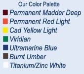
I thought we'd stick with color since we've been on the subject. Pam and I taught a color workshop last weekend that was a way of exploring palette ideas. We worked from our standard 12 color palette, first taking a look at where each color fit on the color wheel and discussed color theory, moving around the warm and cool side of the color wheel. We delved into simple three- color (Triad) palettes. We also talked about complimentary and split-complimentary color palettes along with other color palette ideas...
On Sunday, along with the demo we discussed how color is affected by the light source and what this means to the light and shadow side of an object seen under that light...


Here is the demo from Sunday. I used a triad of R, Y-O, B-G, or Red, Yellow Orange and Blue Green. This is essentially a warm palette and so my completed painting is going to take on an overall warmth that the first painting did not have...


On Sunday, along with the demo we discussed how color is affected by the light source and what this means to the light and shadow side of an object seen under that light...
A true color triad is when you use colors that are evenly spaced around the color wheel. However, some of the color palettes that George Bellows and Robert Henri experimented with were not so evenly spaced. I made up a chart for the workshop of four triad palettes that Bellows was particularly fond of using...

On Saturday, after a talk about the palette and some more general ideas about color theory, I painted a demo using the palette R-O, Y-G, and B, or Red Orange, Yellow Green and Blue. These three colors become my primary colors. I also mixed up my secondary colors from these three primary colors. From there I proceeded to paint this winter scene. I worked from a painting recently completed on site as well as a photo of the scene. Because, I am working with a cold yellow, in this case, yellow green, the overall tone of the painting will be a bit on the cool side. That is not to say that I can't produce a feeling of warmth in the painting, I am speaking about the color relationships of the palette overall...

Here is the demo from Sunday. I used a triad of R, Y-O, B-G, or Red, Yellow Orange and Blue Green. This is essentially a warm palette and so my completed painting is going to take on an overall warmth that the first painting did not have...

Both paintings work, and I've used these two palettes before when painting outside under different lighting conditions. The slightly cooler palette is more like an early morning light before the suns warmth has permeated the landscape. The warmer palette takes on that feeling of afternoon light...
Here are the two paintings side by side...


It sure does open the mind to the possibilities doesn't it?
