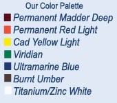
In this post we want to share how we mix up the palette to get the secondary colors. It's a bit of an experiment when you haven't tried it before. Consider this a refresher for those who have studied with us and an offer to explore for those who want to try it for the first time...
We mix an orange from permanent red light and cad yellow light. The idea is to get at a true orange, the color note that is exactly in between the red and the yellow. Anything else will be more of a yellow orange or a red orange...
We like yellow ochre as a color but find the tubed color to be somewhat gritty and not pliable enough. Why not learn to mix it yourself and understand what type of color note yellow ochre really is! By taking a good base of cad yellow light and mixing in some cad red light and a small amount of viridian, you will arrive at a rich and buttery yellow ochre color note...
Rembrandt cad yellow light is a remarkable yellow in that it does not lean towards green nor orange. We think it is a real true yellow. It can easily be moved towards a warmer note by adding a small modicum of orange or on the cooler side with the smallest amount of viridian. The key note here is very small amounts. Sometimes we will mix up piles of the warmer and cooler versions onto our palette...
Okay...so what IS lussier blue you ask? It's what you get by mixing equal parts ultramarine blue deep with viridian and a small amount of white to bring it to almost a cerrulean blue. We once heard from a painter who wondered why on earth do we put viridian green on our palette when you can get a version of it with cerrulean blue and yellow. Our answer is two-fold. One, we don't like cerrulean blue out of the tube. The lussier blue is very much like cerrulean but has better working properties and is in harmony with the rest of the palette. And two, viridian is an essential color note on the palette! Although it is an unatural looking, very man made color, when used in mixtures it cannot be replaced. Viridian is not meant to be used by itself...ever. It belongs in mixtures...
The other three color notes we mix on the palette are versions of purple. By mixing permanent madder deep with ultramarine blue deep and white in varying proportions, we arrive at a blue purple, purple and red-purple. Again...the key is to push the notes to the right place on the color wheel so that you have a purple that is exactly in between the red and blue and then a note that is true red-purple and a note that is true blue-purple. Adding small amounts of white will bring out the color so that you can see the color note...
One more note! We mix big piles of paint onto the palette in order to be able to take advantage of the working properties of painting in oils. Oil paints are meant to be pushed around. if you like paintings that are rich in brushwork...you must come to the realization that you can never get that look without loading your brush with some pigment. It's important to find out what pushing around oils feels like...
One thing painting is NOT. It is not learning to paint up-to-the-lines with a timid approach...
This sounds like something for a future blog...for now here is an image of one of David's paintings done from yesterday. He set up to paint something to the right of this subject but when he shot a glance to the left he immediately saw this painting and decided to tackle it.


3 comments:
I agree about Cerulean blue out of the tube, I think it tends to be weak and way to expensive. When you say you mix big piles, about how much are you making and for how long are you mixing for;ie one day, a week ? thank you and looking forward to next post.
Hi Dan. I probably squeeze out about 2-3 inches of each color Ultramarine Blue, Viridian and White. I always put about 5-6 drops (not too much or it will never dry) of clove oil into the piles and mix it well. This will keep them from drying out too quickly. If you block in a painting thinly with gamsol or turps, the paint will still set-up quikly. My palette is also inside my paint box and closes fairly tight which helps too. I'll try to show a pic of my palette in my next post with all the piles. I was down with food poisoning this week for a couple days. I'm behind in my blog.
I'm sorry to hear that, feel better soon.
Post a Comment