
We think of substituting the word 'edible' for 'harmonious'. So it's more like,"Your colors look so harmonious...what are they? From this we arrive at the conclusion that a palette that is in harmony is going to invoke an emotion right from the start. It 'feels' right....
The basic six color palette in itself is enough to start working from ,but it's the six other colors that we mix from this basic palette that will truly showcase it's harmony. Armed with this complete color palette, we now have a fighting chance at having our painting sing in tune.
We mix the other colors in big piles and place them on the palette along with the basic six...
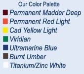
The basic six are: Permanent Madder Deep, Permanent Red Light, Cadmium Yellow Light, Viridian, Ultramarine Blue and Burnt Umber...
From these we mix: Orange, Yellow Ochre, Lussier Blue, Blue Violet, Violet and Red Violet...
In reality, we have taken a primary palette and mixed a secondary palette from it. If we mix these secondary colors from the primary palette, we can't help but arrive at a set of colors that all look and feel right. By mixing them and placing them on the palette prior to painting, we have more visual clues that we can work from than if we just mix these secondary color notes as we need them during the painting process...
We've been working with this same palette for close to twenty years! When we think about what can be done with a palette that you know inside and out, backwards and forwards, the possibilities are endless. Color is something that will never stop demanding more thought...
In the next blog, we'll write more about this color palette and how we use it, until then, here is a little beauty of Pam's from a studio series she is doing...


1 comment:
Lussier Blue? I gotta see this, could you post a palette photo in the future? I'm glad you started a blog together, and hope to learn alot here. Thank you, Dan
Post a Comment